

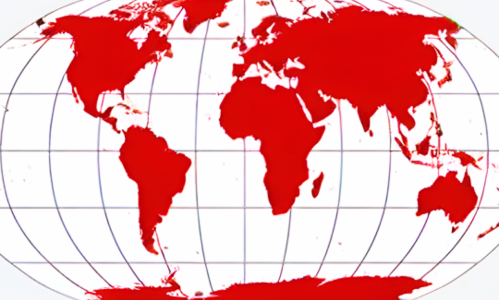
Did you know that the Mercator projection, commonly used in maps, distorts the relative sizes of countries, making regions near the equator, like Africa, appear much smaller than they are?
Africa, the second-largest continent, covers 30.37 million square kilometres and can fit the United States, China, India, and most of Europe within its boundaries. However, the Mercator projection makes Greenland appear similar in size to Africa, despite being much smaller.
This distortion affects our perception of Africa’s importance and scale.
Using alternative map projections, such as the Gall-Peters projection, which accurately represents the relative sizes of landmasses, can help us better appreciate Africa’s true size and significance!
Read further here